it was hard to find a website that was designed to be just for dog walks as most of the website i had found already that had pages on this topic where just plain white.
my target audience is people of the older generation between 40-90.
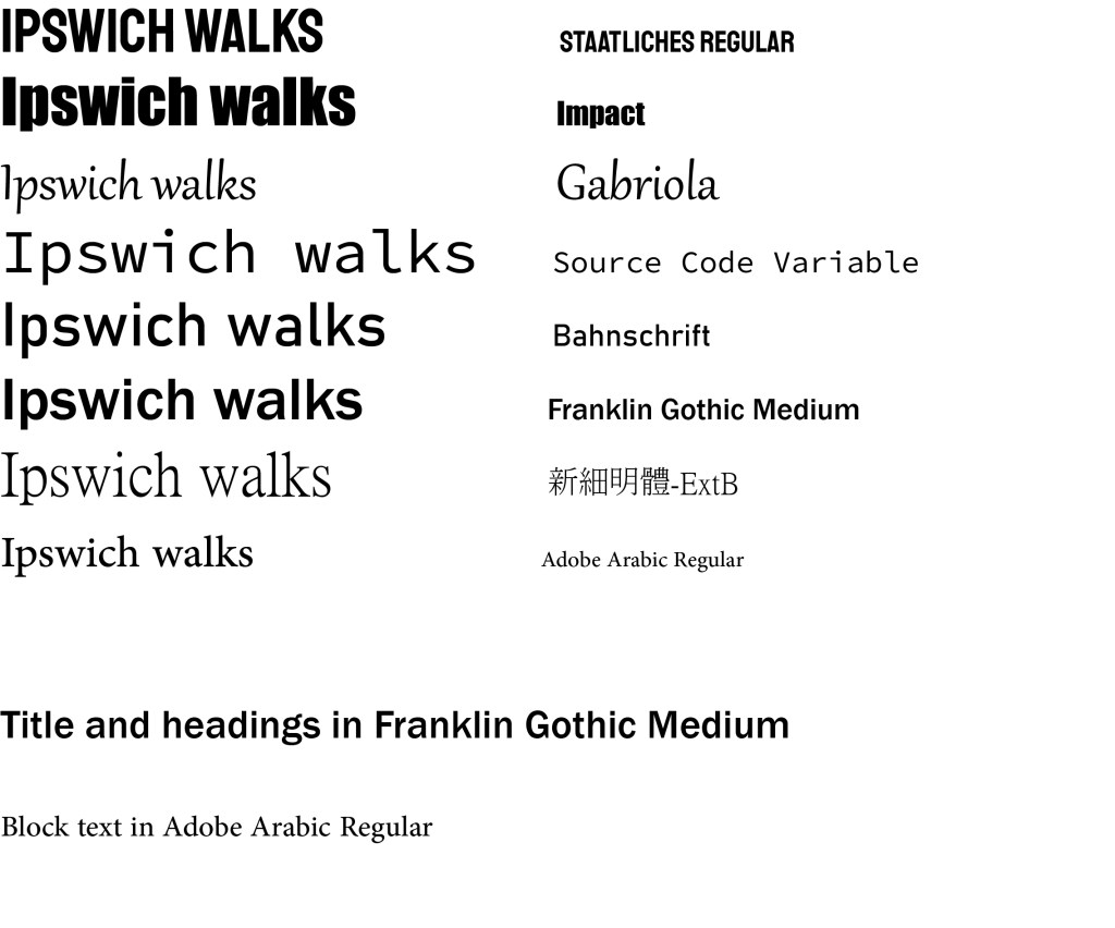
As my target audience is aimed at the older generation my colour pallet is more aimed at them and it will be lower saturation colours. The text i used is bold and easy to see for the target audience.
For the design and layout of my website, i am going to do a simple design which is clean and easy to navigate thought, so it is user friendly for my chosen target audience.
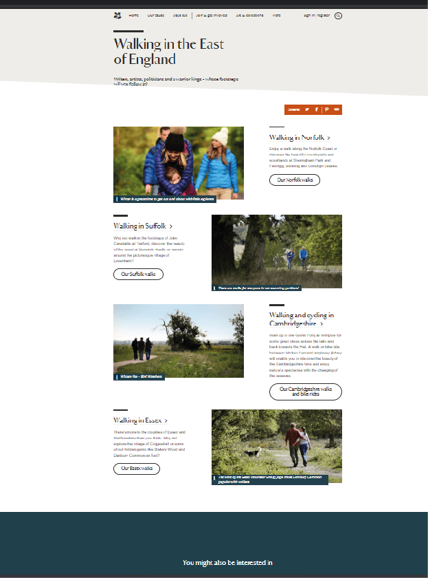
These two website are local website for my area (Suffolk) i picked these two out because i liked the clean navigation on the left website and the minimal text and clear big pictures, i picked the right one because the short paragraphs and the big pictures being the main focus, i will be using elements of both of this two websites to construct my own, i will be using some of the elements i have just stated. As it is fitting for my older generation target audience.
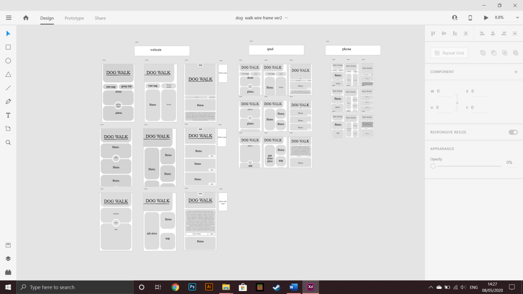
After looking back at these 3 consent the design on the left of each platform wouldn’t of worked as it was to round and would of only really worked on the phone app.
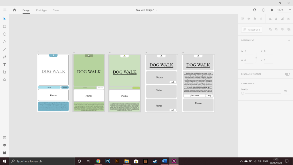
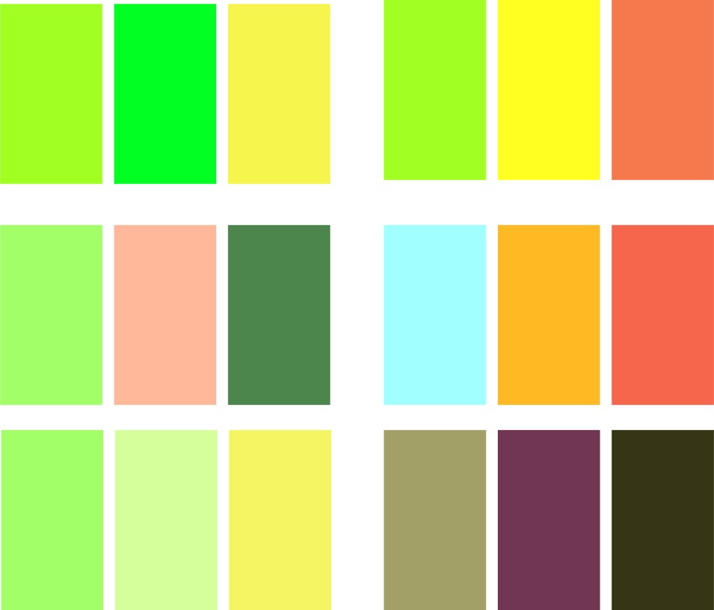
the second colour palette is in my option the best this is because the colours are very aimed at nature and i think is the best colours to resemble the dog walk website, the last colours where just changing the dark green from the previous one and making it a line ish green, i think the green stands out to much and doesn’t really fit in, all the colors had be de-saturated as i didn’t want them to be bright and obnoxious for the target audience. i also like the second one as the green behind the text still shows without taking colour away from the text and making it blend in.
i will be using the second colors for my final websites as they are the best to resemble a nature vibe.
