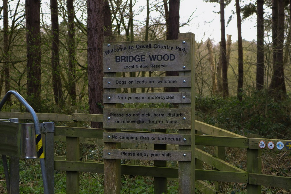
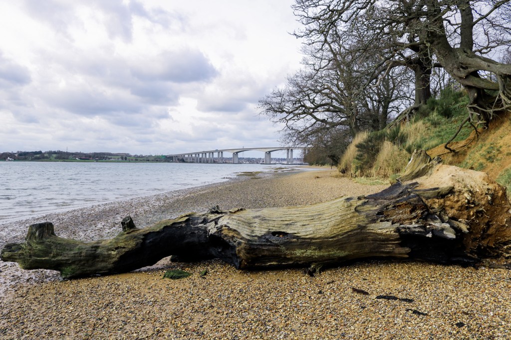
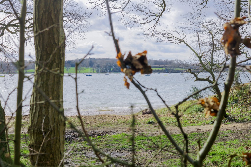
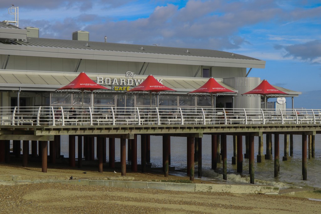
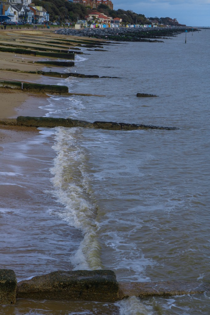
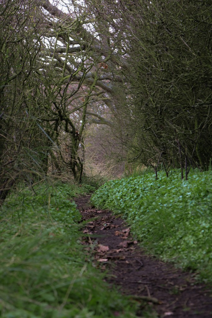
these are some of the photos i gathered from my travels to take pictures of the 3 locations which are on my website, i wanted to take pictures of what it looks like whilst on the walk and paths which the target audiences will be walking on if they choose to go to these locations, i added photos which had good camera angles such as once from a lower prospective to make it look like a dogs POV. i also included lighter pictures so that text onto the the images wouldn’t get lost in the darker colours. most of the pictures included the best sights of the walk like the Orwell Bridge, i tried to gather pictures which follow the green colour pallet of the website as well.
This is the final outcome to my website, i went with nature colours of woodland greens which brought colour to the website whilst being subtle, addition to the block colours they are lowered in opacity to make it more mellow and blend in. I used elements from the 2 website above like the blocked layout and clear navigation, i created a simple logo which was fitting to the topic but simple and catchy, for my typeface i used Segoe UI as it was a clean but simple text for my target audience to read, A addition to the “GALLERY” in the chose font i also added a picture which was specific to the location so it was even easy to identity the location stated but also make it more user friendly, if the user fund it hard to read they can just navigate thought with pictures they liked which will in the end lead them to the walk location depending on the pictures they like.
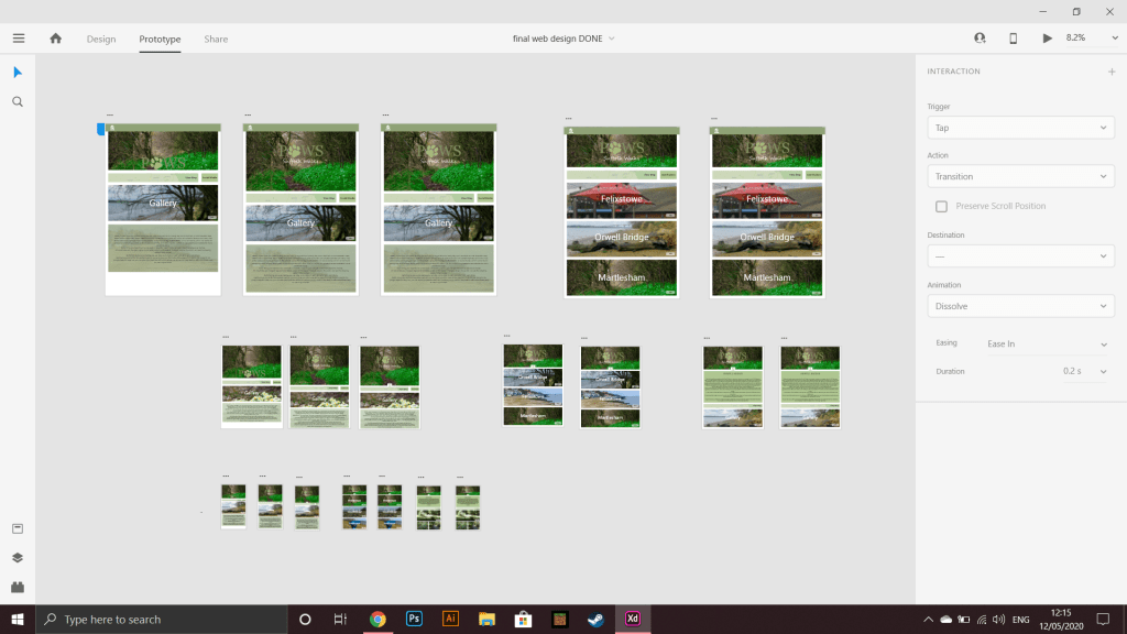
the navigation is very simpler to the website above on the left with clear to read buttons which will take the user to the next page or home page.
I also added a little animation when loading up the website or onto another page, which i believes a small detail which makes the website that more profession and unique.
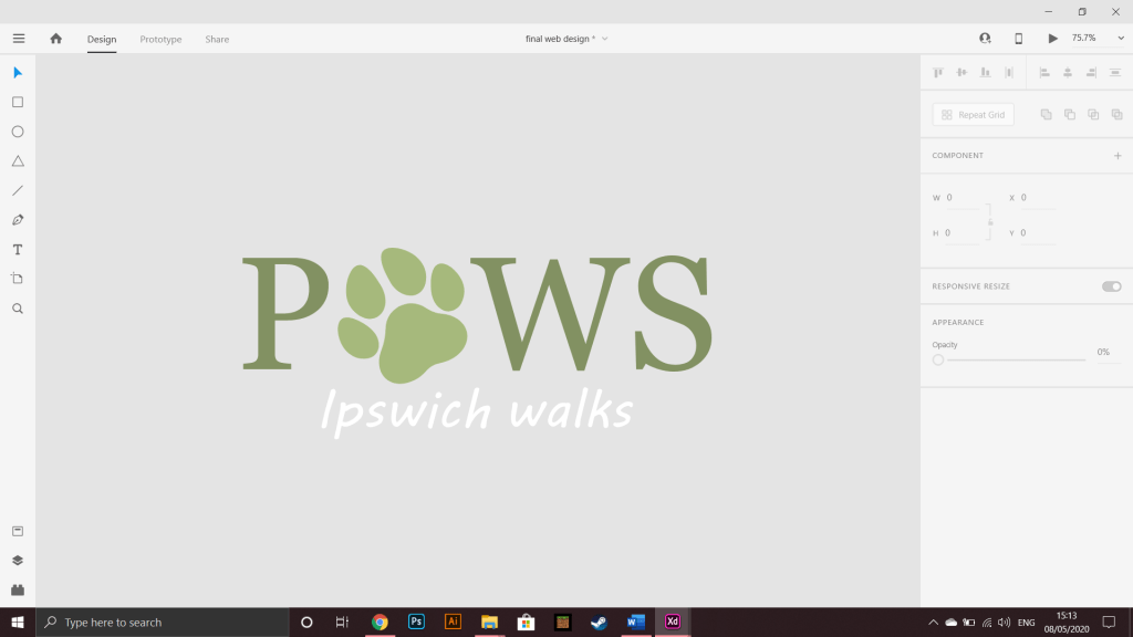
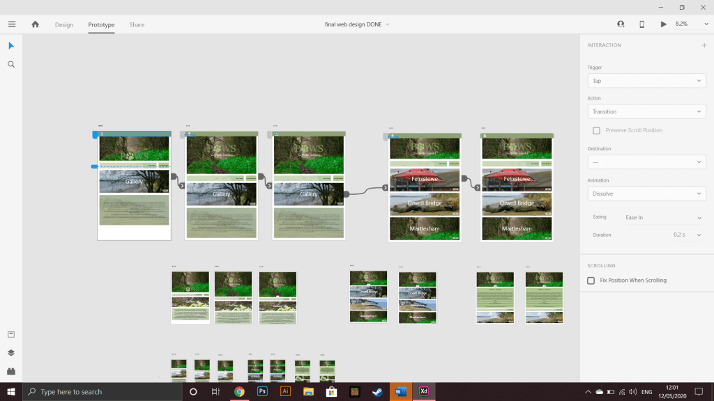
after learning how to do this i then learned how to make objects and the page move, i made the paw of the logo spin when the page loads up then went on to make the page move up to the top when a new page is loaded, i learned having different pages with different animations and then linking them together with a time worked.
i made the time go on for a few seconds before the animation started so it could be noticed by the user, i didn’t want any thing big and load as my target audience was much older and this wouldn’t really appeal to them .
I added various subtle details to the websites from making the background colour of the text slightly transparent, and having a image behind the back to add more characteristics and texture to the website, i also made the banner heading of the website the same thought out the pages so it was seamless with page changes but also to keep the same theme on each page.

i also made the text a bit bigger on the two smaller devices as they are smaller so the same size text from the PC website would be to small to see. i finally made the spacing between boxes smaller on the two smaller devices to add more to the page.
I am really happy with my 3 website outcomes i really enjoyed making the animations and page changes as it was something new to me and XD made it a fun process, i also enjoyed making several wire frame as it was a new way of working for me and allowed me to make more decisions at the start of the design.
next time i think i would like to add more pages as some of the buttons on the pages didn’t work as we where only allowed a limited amount of pages.
i would like to improve on my wire frame design skills as it was a good first step to creating and design a website which helped out from the start and towards the end to.
