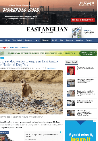
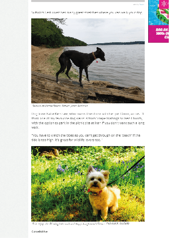
PAWS DOG WALKS
It is more or just information about different walks and doesn’t really have any strong design on the website as no one who is going on the website is really there for the design of the website.
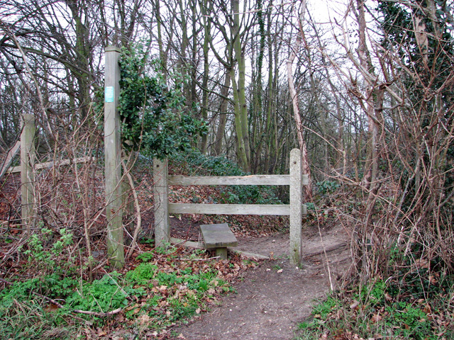
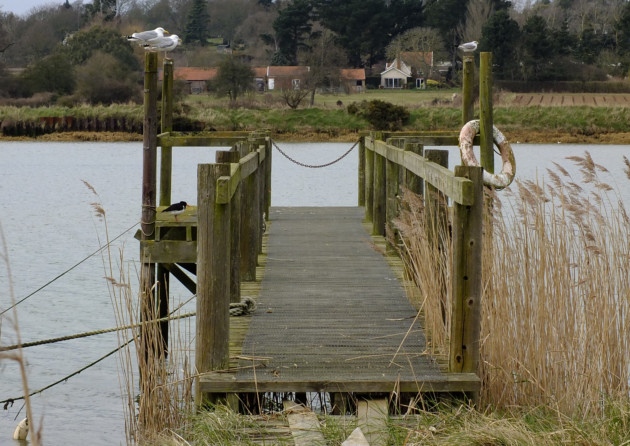
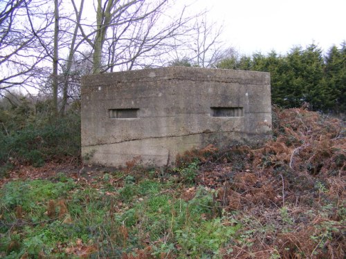
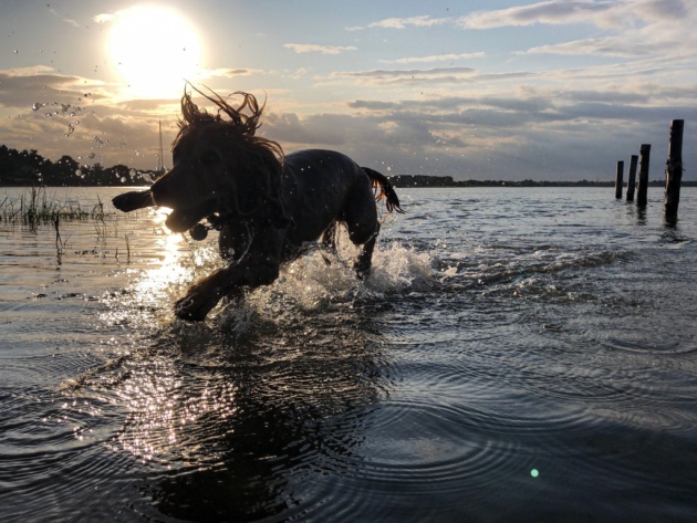
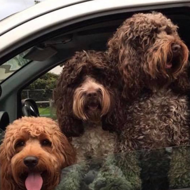
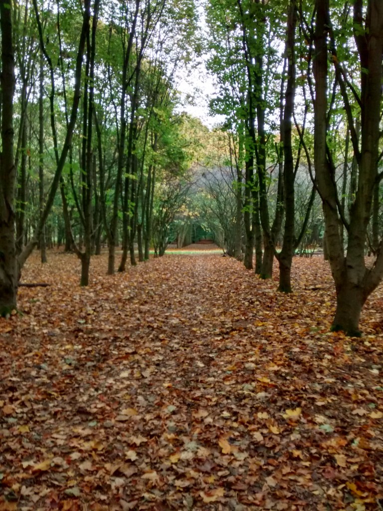
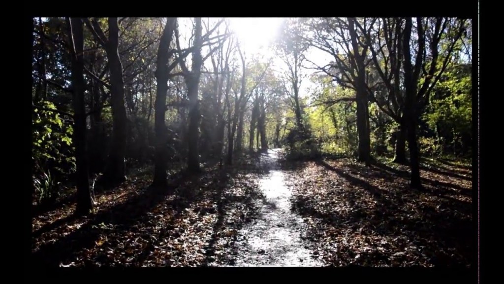
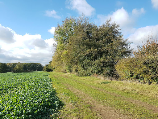
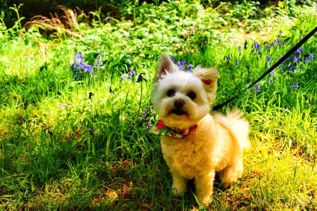
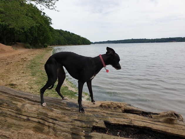
It has pictures of dogs in the location where the dog walks are, and information about the place.
The photos are the main focus with the text in a small font size below.
The location is stated and is clear to see.
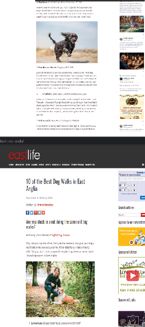
This website is similar to the last one and is very much simple with big pictures and block text, with a clear title of the place been talked about.
East Life has adverts down the margin which aren’t all necessary to the topic of the website, both websites have thick margins with centred narrowed text down the middle.
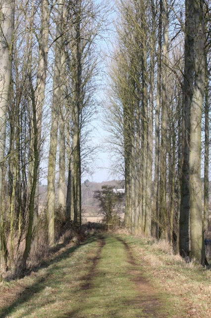

i also like the structure of the page with the white background and the thick margins, i like these two points because it doesn’t take away from the image and doesn’t cover up the text.
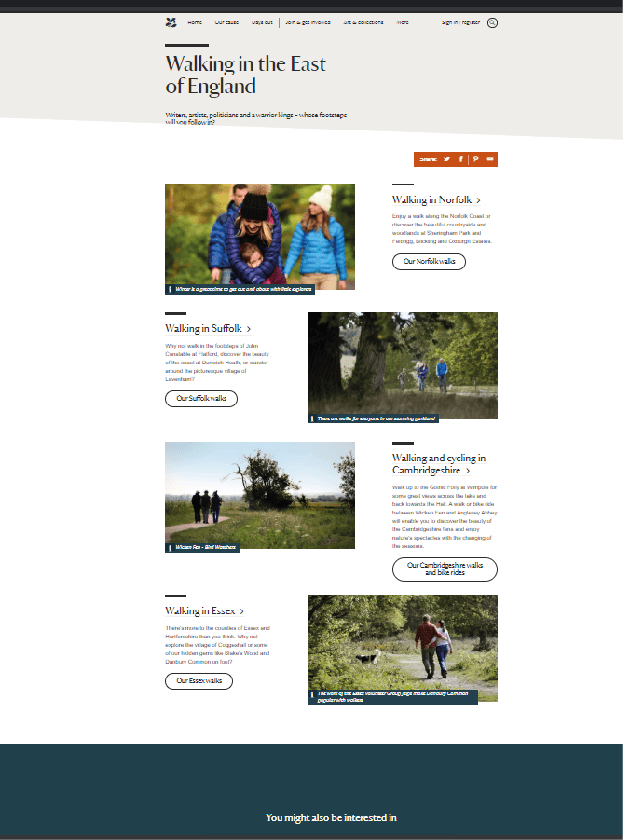
This website is much different from the last two this being because it has more of a design behind it, the front page is split up into 3 section these section are areas, which when clicked on gives you more information about walks in that area, the theme of the website is white and dark blue with black text in a serif based font.
There is blue bars at the bottom of each picture telling you who took the picture and where it is.
It has rounded off squares which are buttons which talk you to the next page inside of button it tells you what you are clicking for.
The target audience of these websites are going to be middle age to older people so having big buttons with a clear note of what it is would be better suited to this target audience instead of just a button or symbol.
